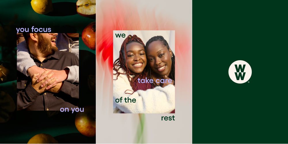
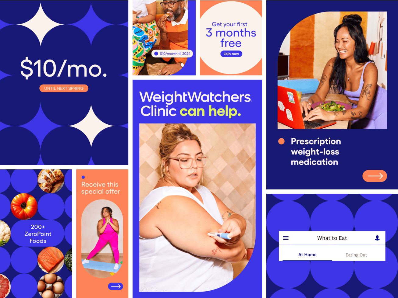
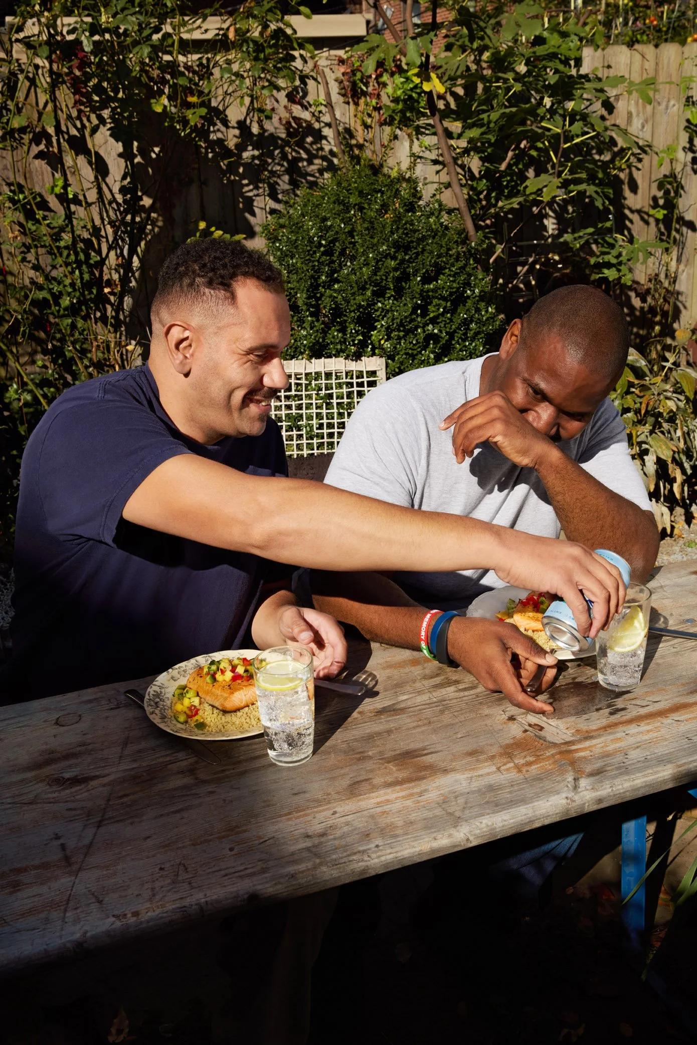
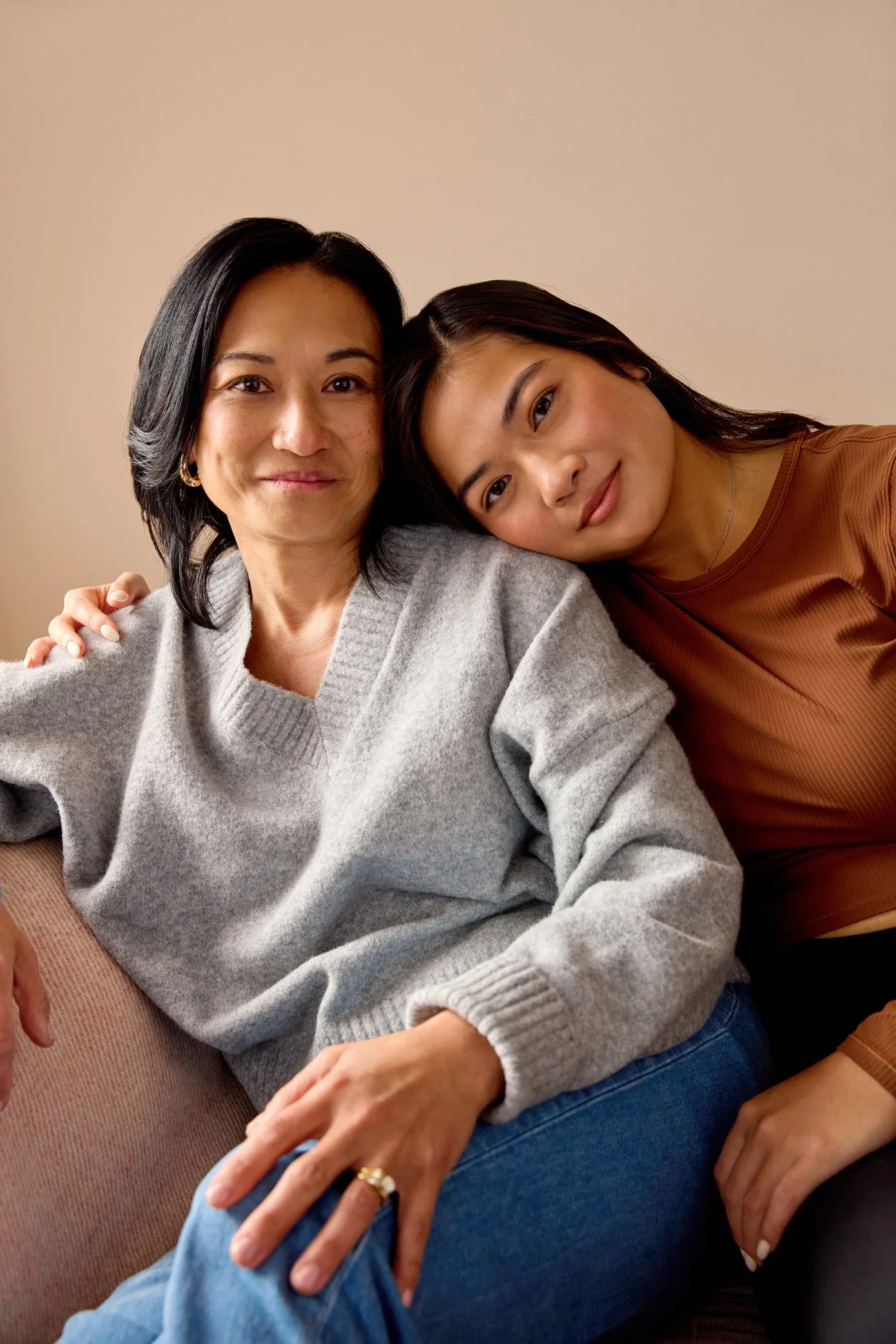
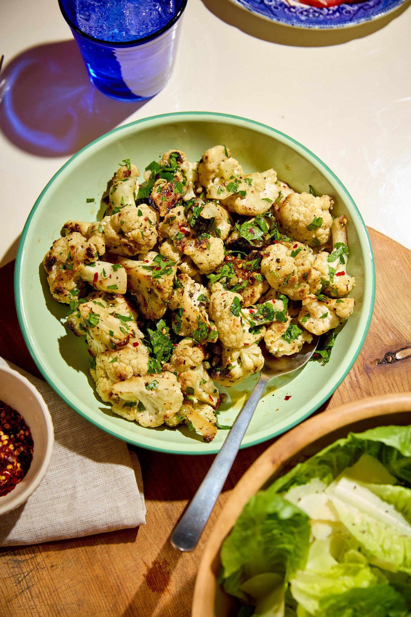
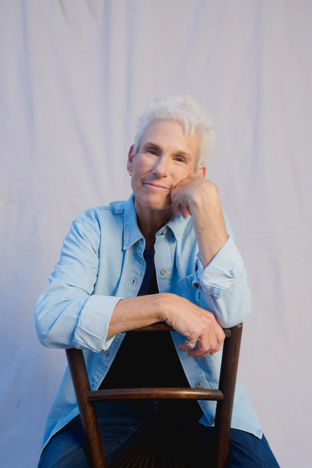
brand refresh
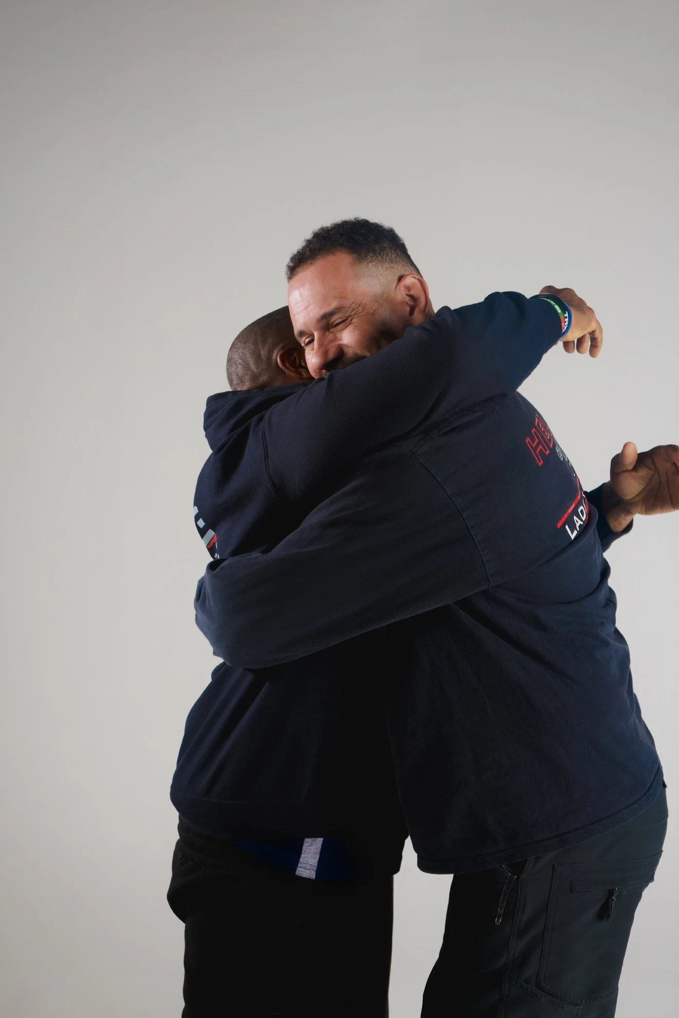
As a legacy household brand, WW has had to reinvent itself in order to attract a new audience. In 2024, we refreshed the brand to infuse it with humanity, leaning into real moments of our members’ everyday lives and the support that comes from interpersonal relationships. What does the program look like for a member who prioritizes herself, has ups and downs, and moves through life with confidence and self love?
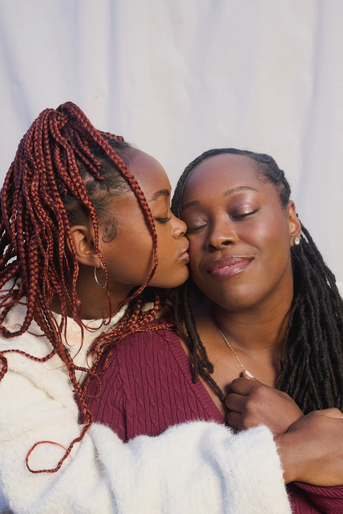
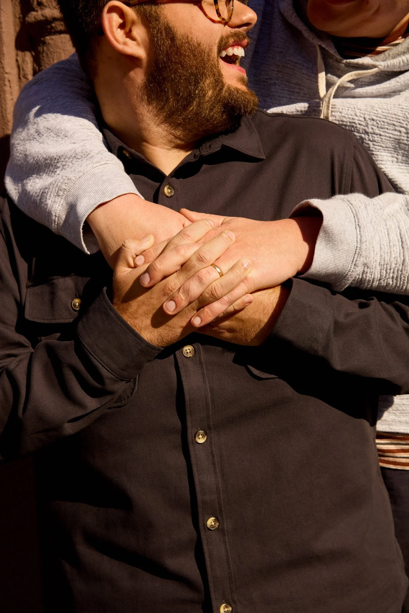
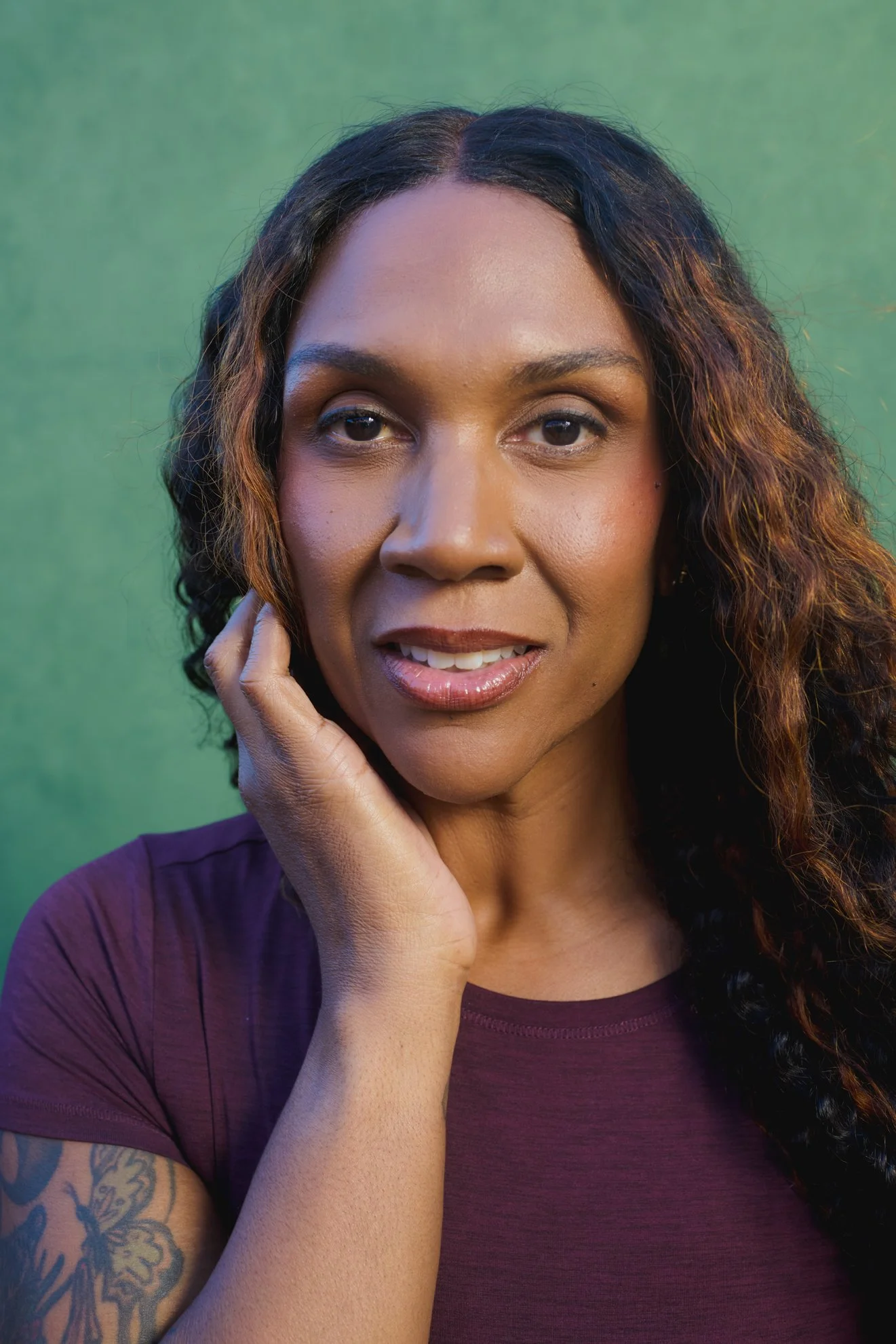
By showing “slices of life” through their POV, we ultimately shaped a brand that celebrates everyday moments and feels authentic and fresh.
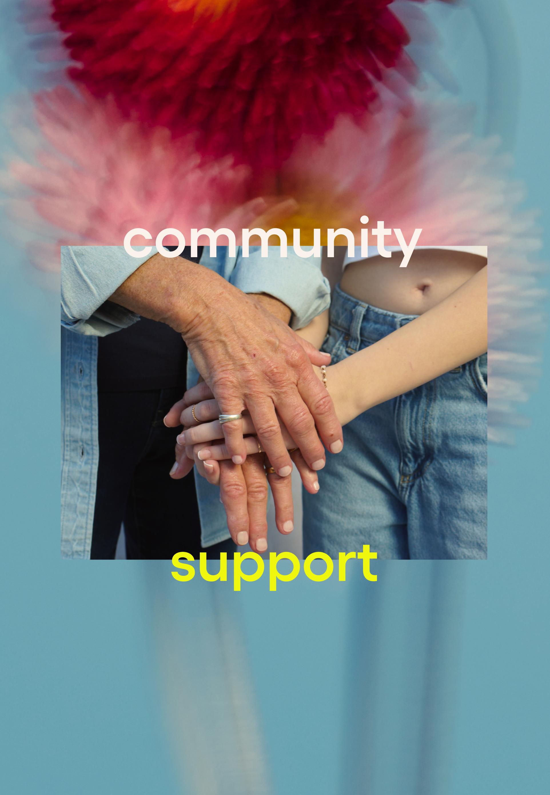
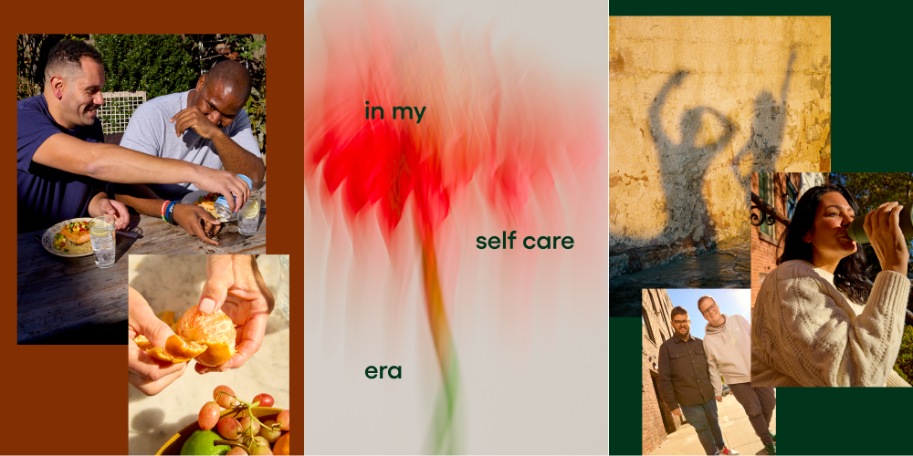
exploration
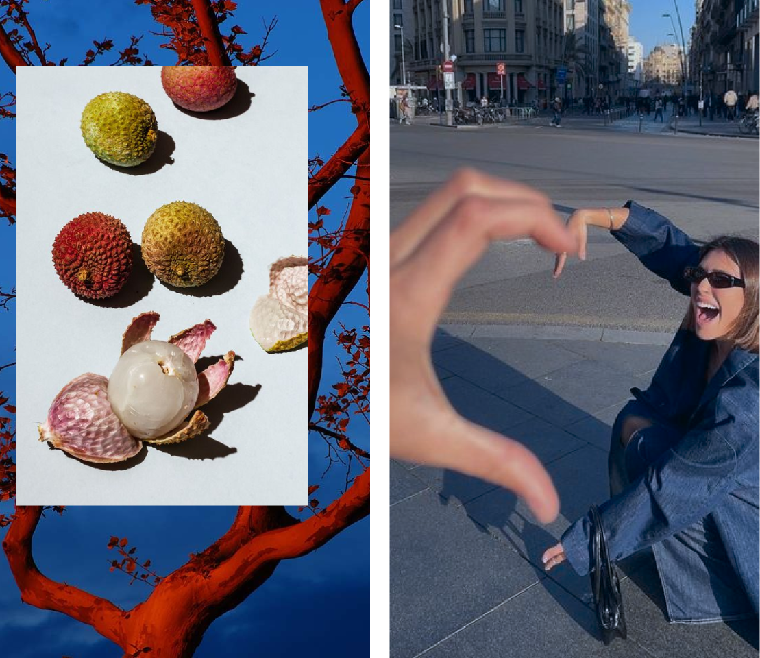
Once a mood board was established and the tone was set, I built vignettes to bring the concept to life. Collaging images found online, I test drove color palettes and layout treatments to work out how this style can be applied to the WW brand.
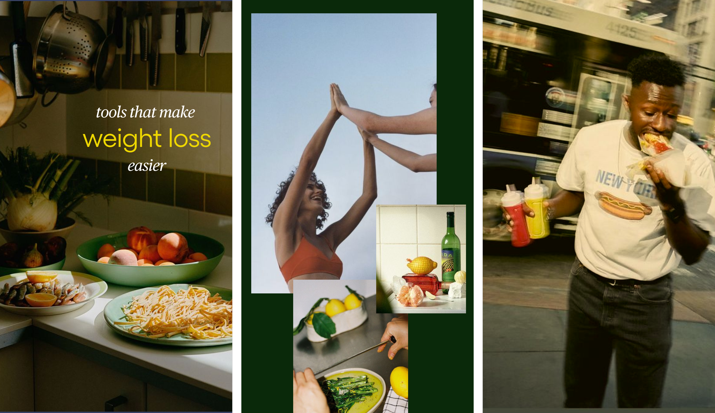
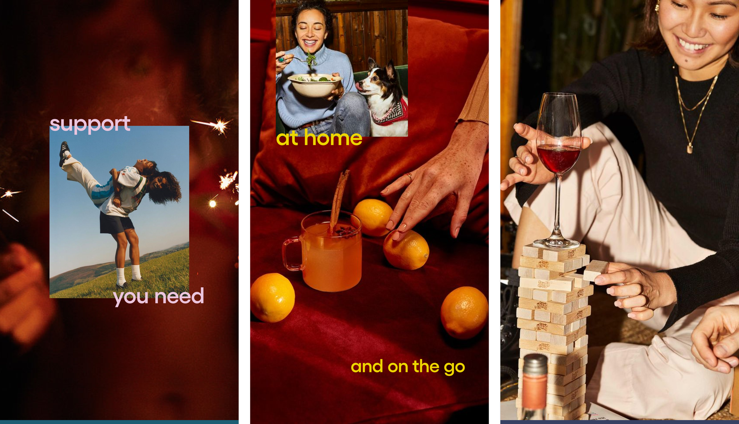

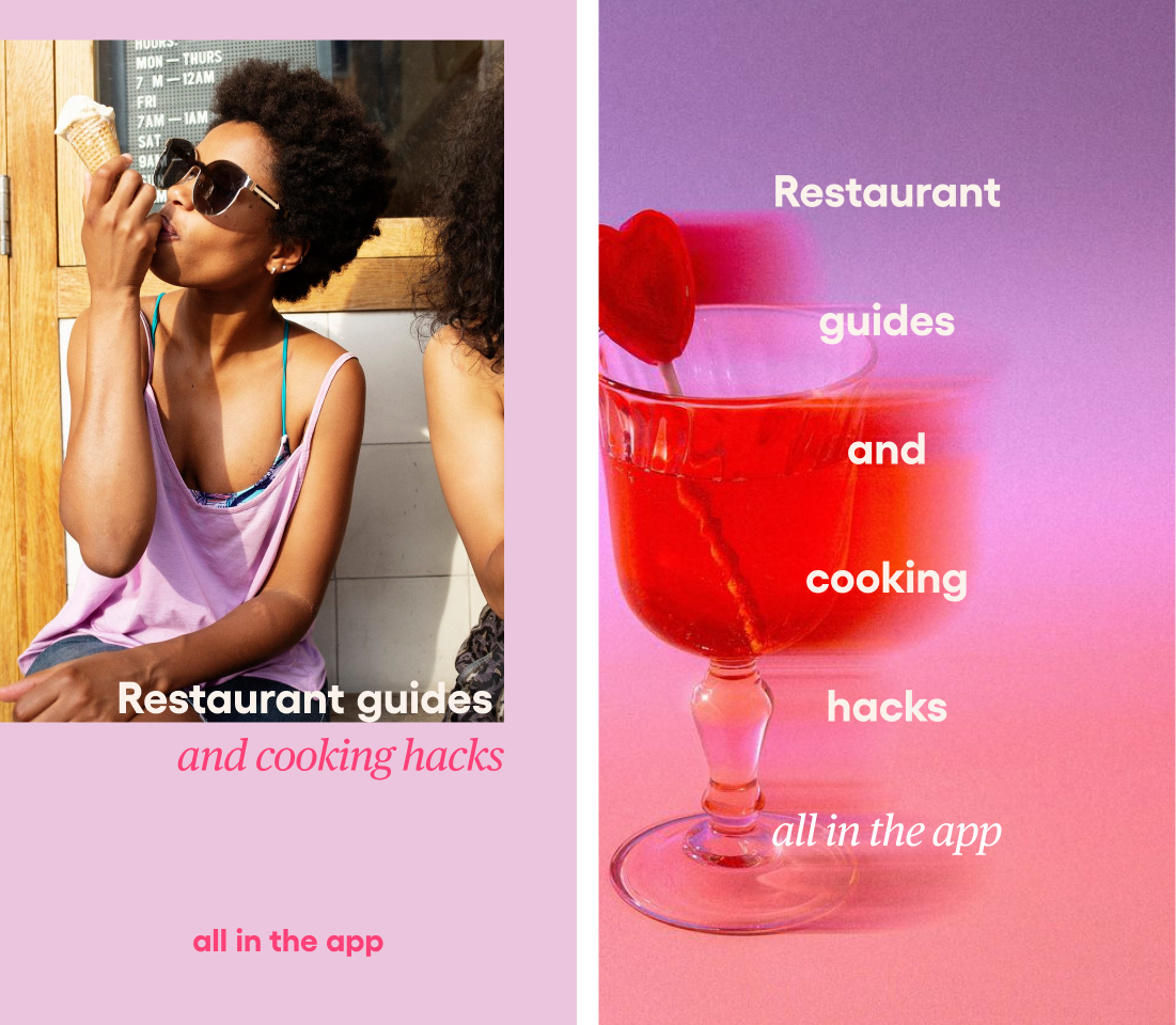
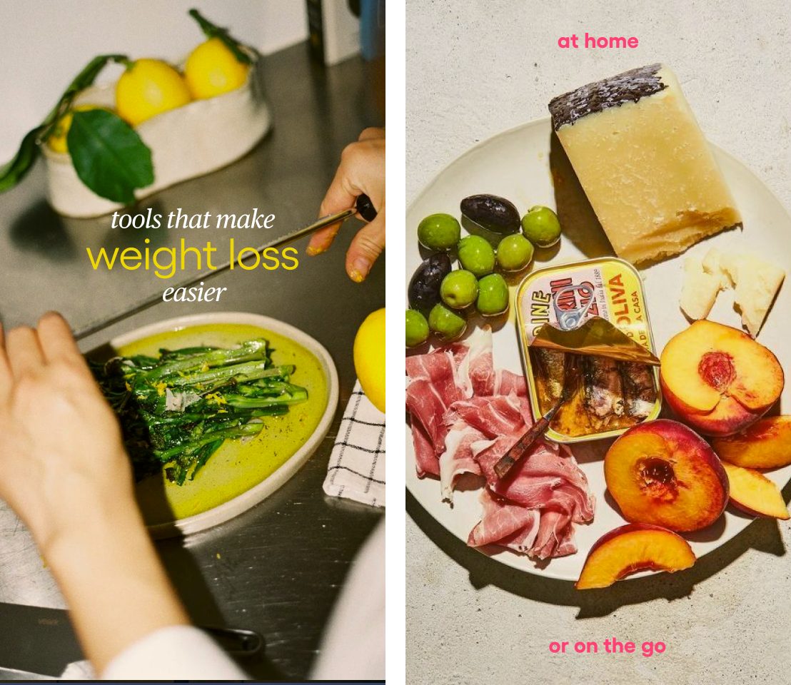
Next, I reskinned existing brand assets to pressure test potential color palettes and photo styles. This allowed me to quickly work out the new visual identity without copy re-writes or elaborate redesigns.
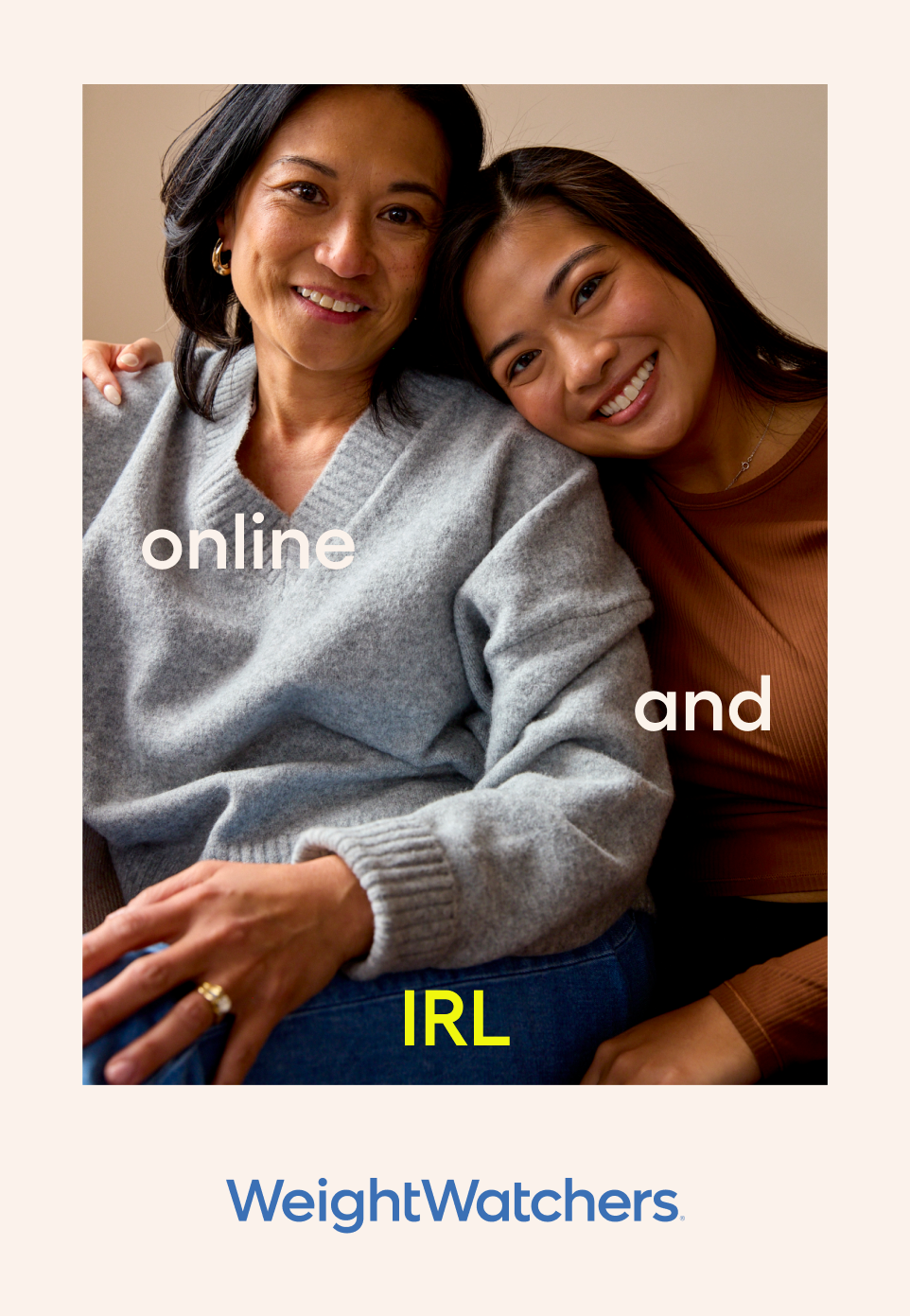
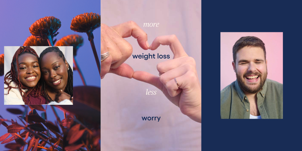
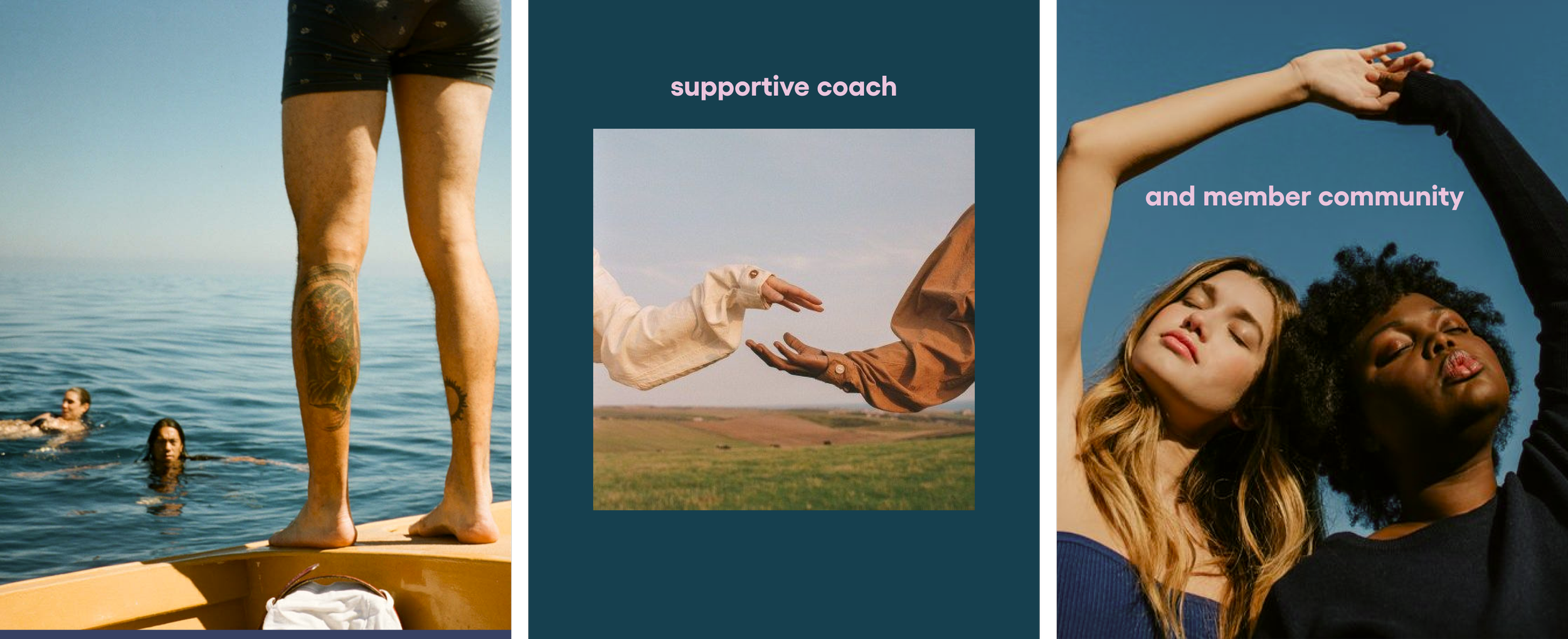
photography

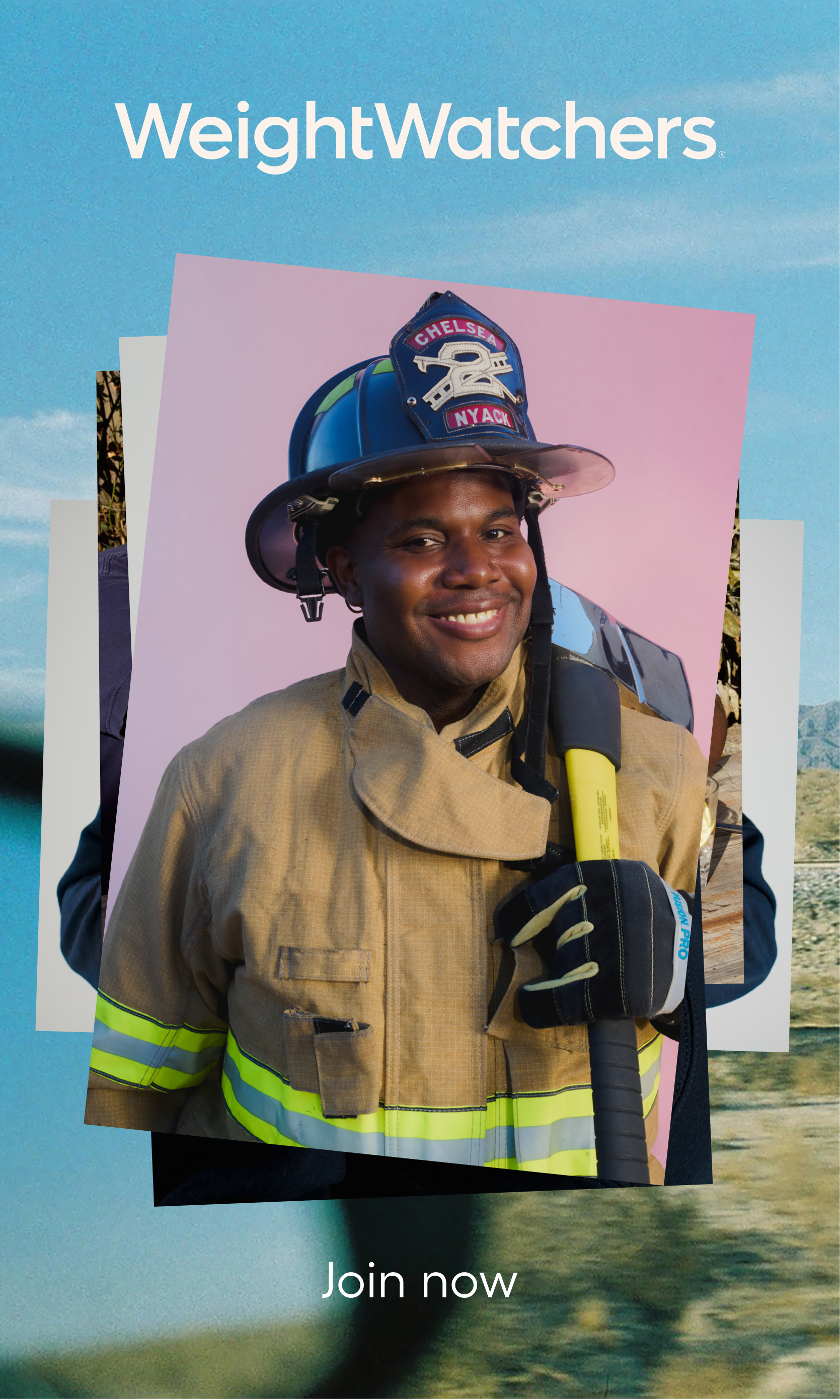
bringing it together
The brand refresh was ultimately brought to life with a dedicated member photoshoot, ambient images and an updated bolder color palette.