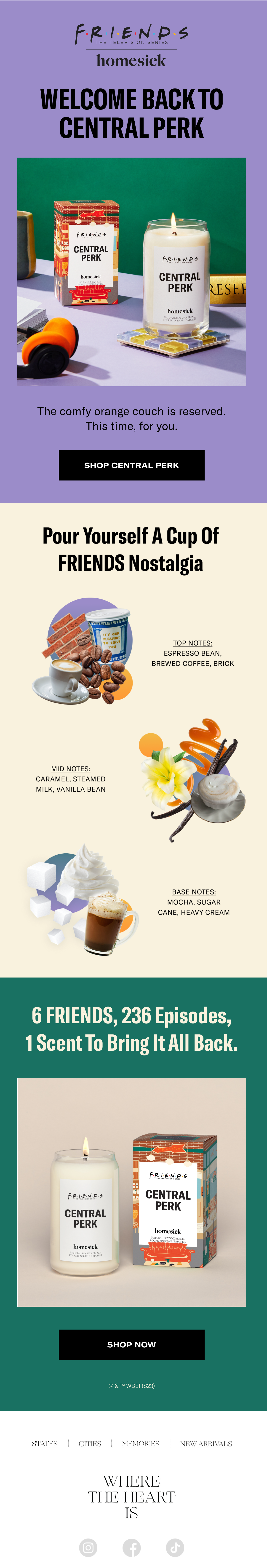
Homesick Candles x FRIENDS Promo Email
FRIENDS is my ultimate nostalgic guilty pleasure show so of course I rushed to open the email upon reading the subject line: Now Available: Central Perk ☕ . I love the retro set design in the masthead photography, witty (and minimal!) copy, and the color palette that immediately takes me back to Monica’s apartment.
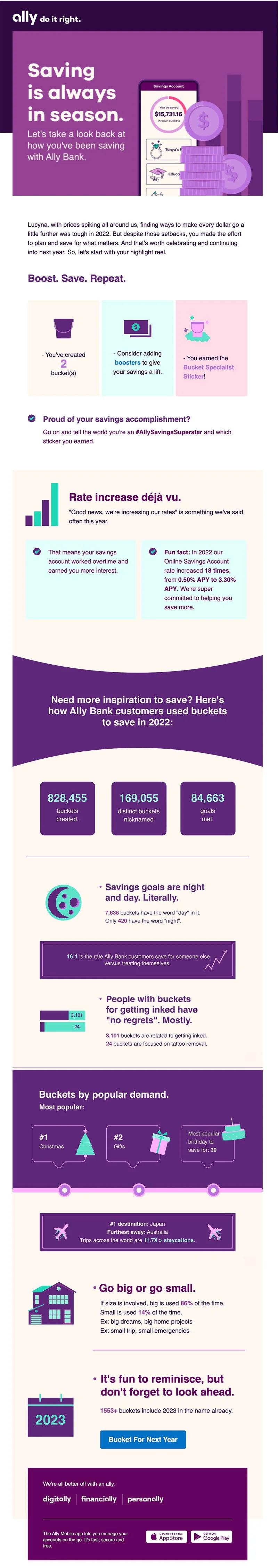
Ally's 2022 Saving Stat Recap Email
It seems like every brand is jumping on the year-in-review bandwagon 🥱 after Spotify Wrapped’s success, but this email from Ally Bank makes it fun by including stats from their collective users. Did you know: Japan was the #1 travel destination users saved up for in 2022? Proof that an email doesn’t have to be flashy to stand out.
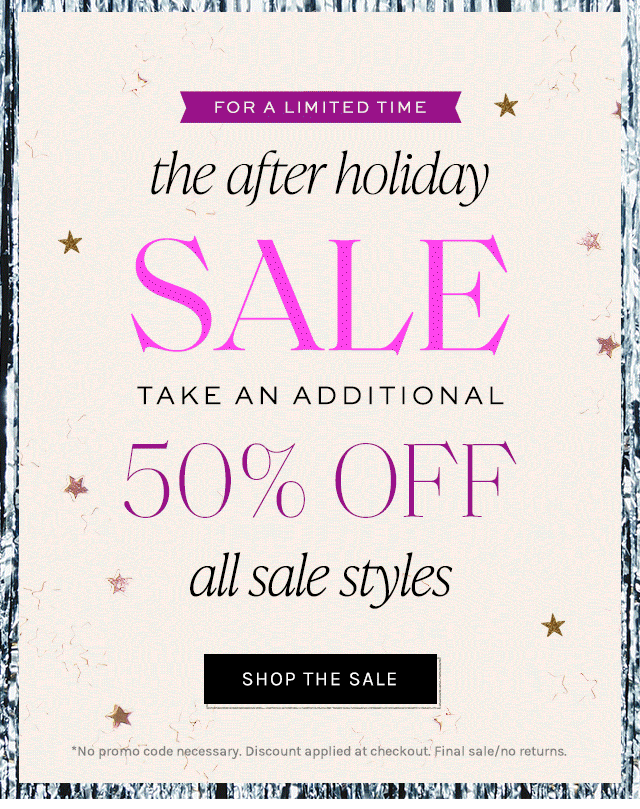
Free People 50% Off Email Slice
This email slice from Free People’s after-Christmas sale caught my eye and I found myself clicking through. I love how the different type styles (all caps, upper/lower) play together, and the spacing throughout feels just right.
Reddit Landing Page
Though Reddit is synonymous with its iconic martian and orange bubble, I love how the eye-catching color is used as an accent in an otherwise neutral palette. The simplicity, use of grids, simple patterns and illustrations that add texture…10/10.
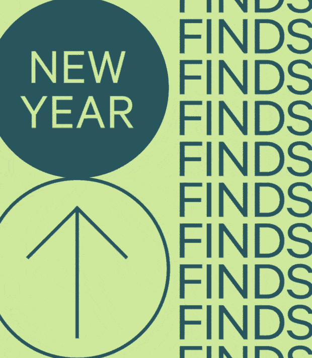
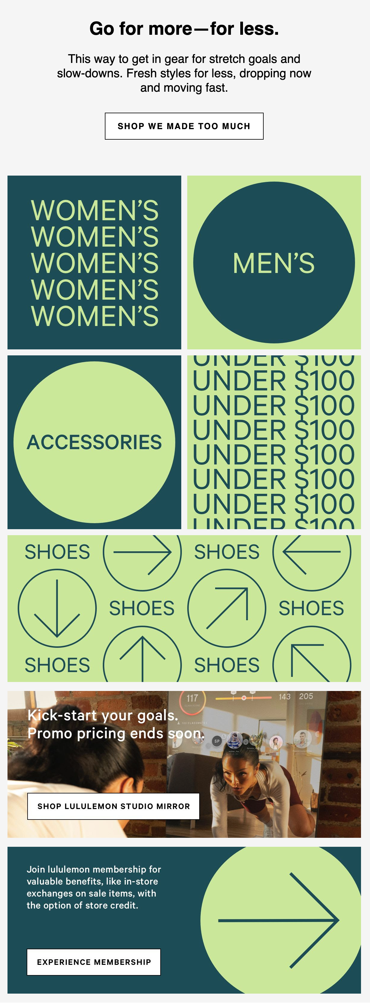
Lululemon New Year New Finds Email
I’m a big fan of Lululemon’s simple, pared down emails. The sparse copy and two-tone color scheme carries this email—and how incredible is this masthead gif?
Emily in Paris Instagram Posts
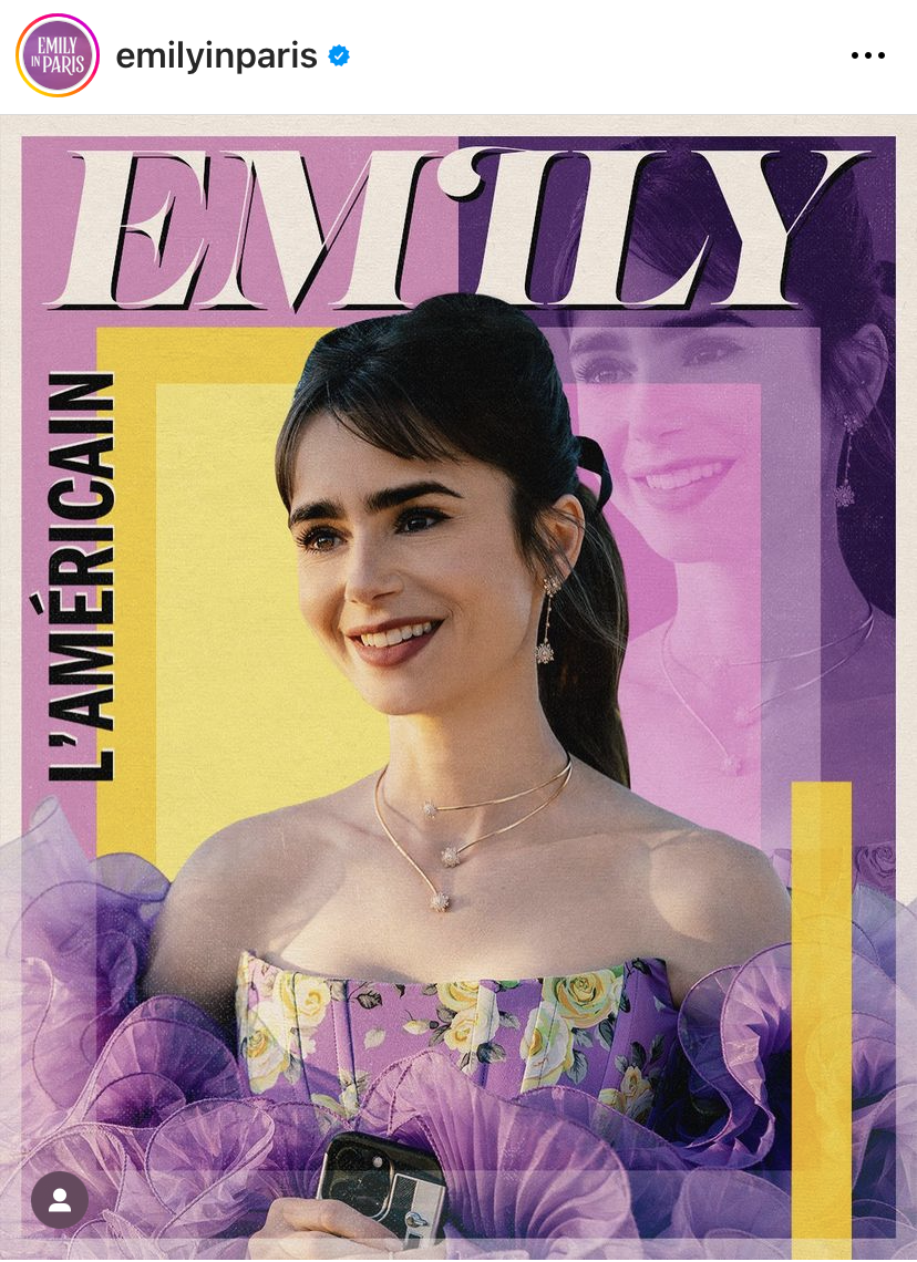
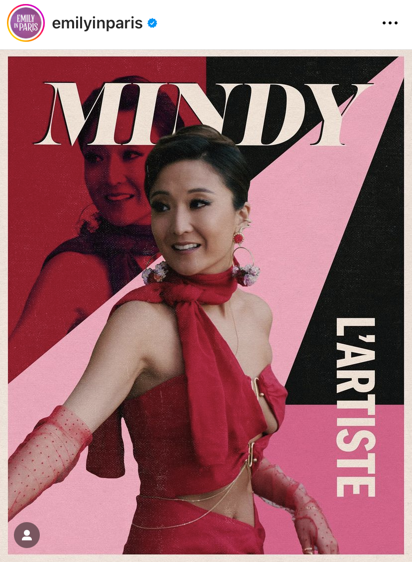
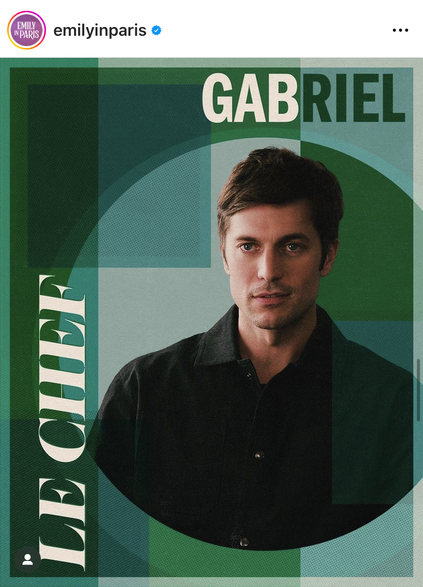
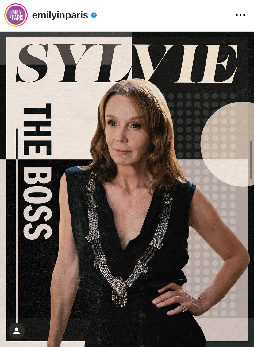
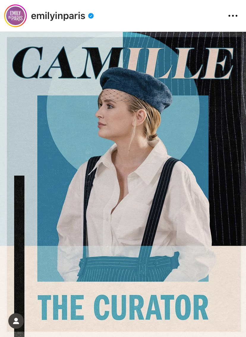
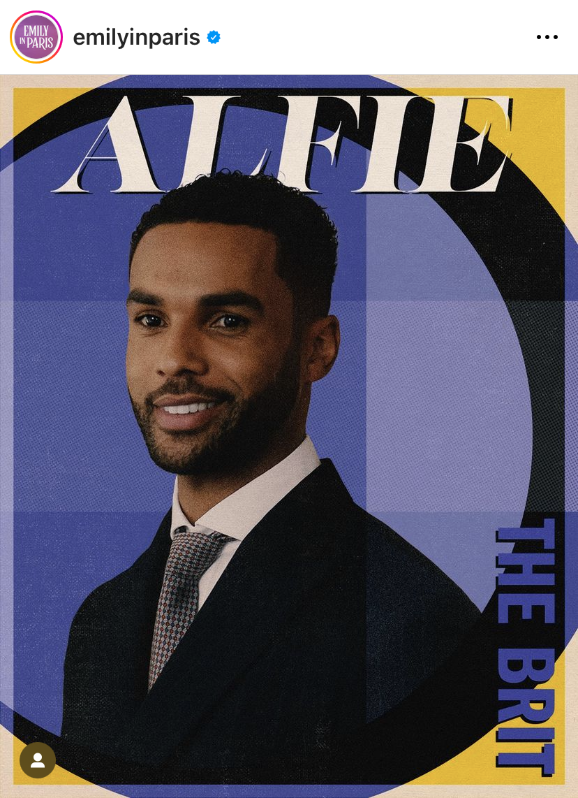
Though not necessarily a fan of the show (I follow the IG account for the fashion), I love the type, color palette, and abstract shapes in these posts dedicated to each main character. Voila!
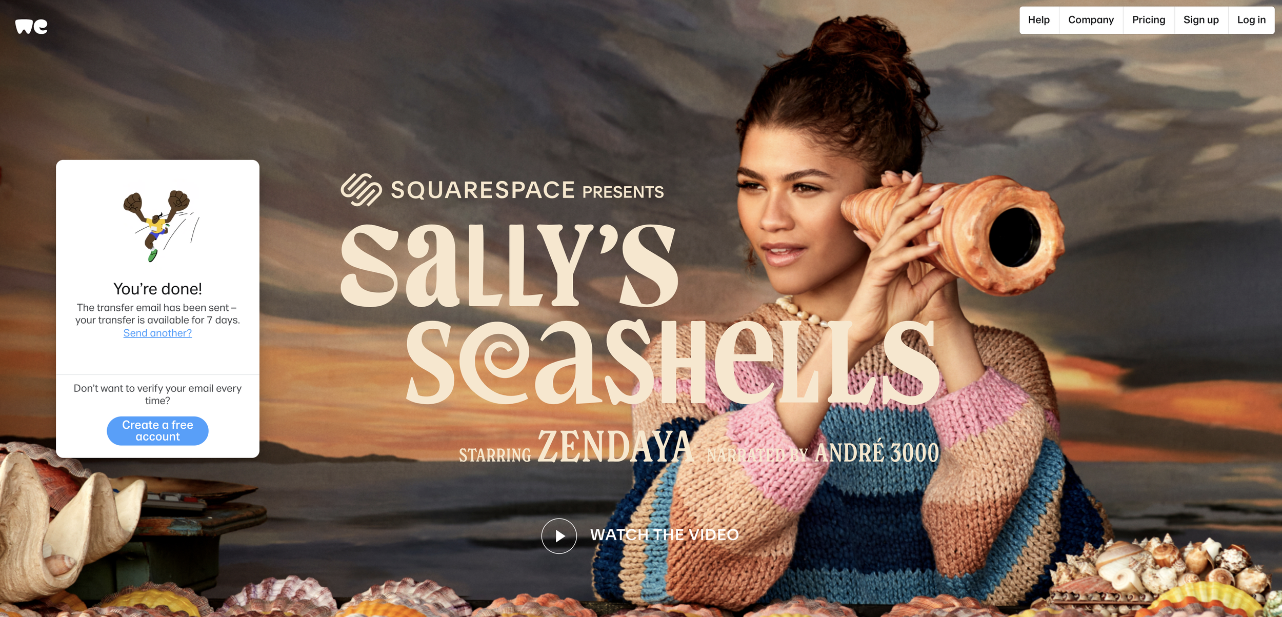
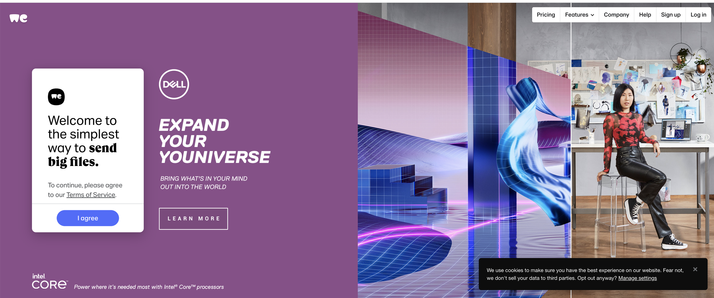
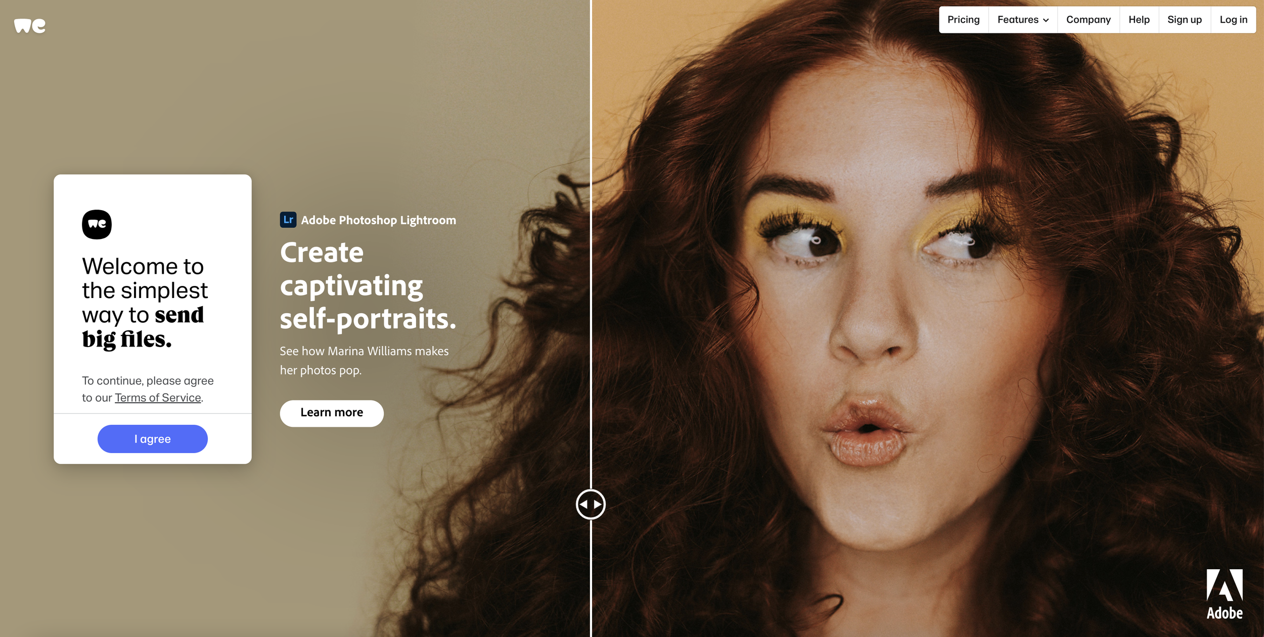
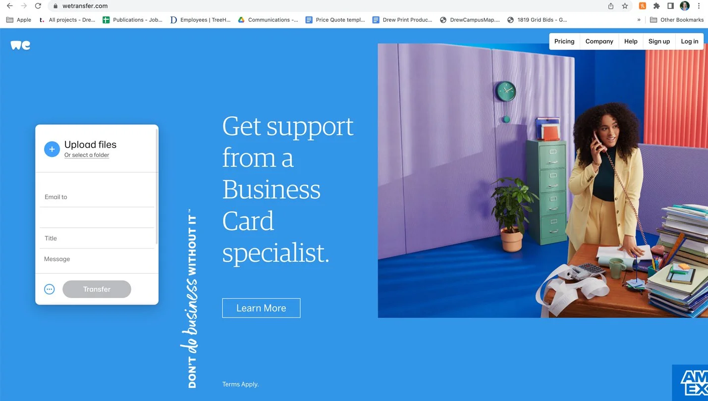
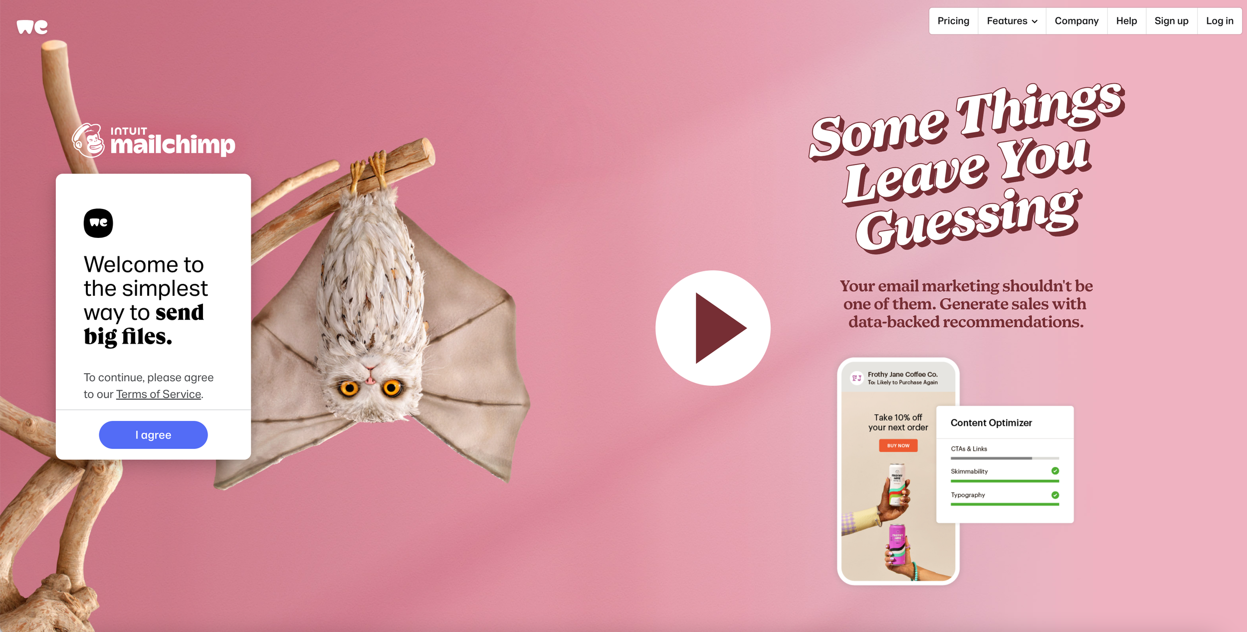
WeTransfer Splash Pages
Having designed many landing pages over the years, I know how difficult it is to a put together a layout that’s equally successful and responsive across a multitude of screens and screen sizes. WeTransfer always hits the mark with dynamic layouts, no less.